
Screen Resolution Checker
Values update when you resize the window or move it to another screen. Nothing is sent or stored.
This free screen resolution checker shows your display resolution the moment the page loads, along with your scaling level, browser window size, aspect ratio, color depth and whether your screen supports HDR and wide color. It works on Windows, Mac, Chromebook, Android and iPhone with nothing to install, and none of the information leaves your browser.
What Is My Screen Resolution?
Your screen resolution is the number of pixels your display shows across and down, written as width x height, for example 1920 x 1080. The figure shown by the screen resolution checker above is the real, physical resolution your system is using right now. If it is lower than the resolution on the box, your operating system is probably set below the native resolution, or display scaling is making the browser report a smaller size.
What Each Value Means
| Value | What it tells you |
|---|---|
| Screen resolution | Physical pixels across and down, such as 2560 x 1440. This is the number on the spec sheet. |
| CSS pixels | The size the browser uses for layout. On a scaled screen it is smaller than the physical resolution. |
| Display scaling | How much the system enlarges text and apps. 150% on a 2560 x 1440 screen gives 1707 x 960 CSS pixels. |
| Viewport | The visible area inside the browser window. Web designers use it to test layouts. |
| Aspect ratio | The shape of the screen, such as 16:9, 16:10 or 21:9. |
| Color depth | Bits per pixel the browser reports, usually 24 (8 bits per color). |
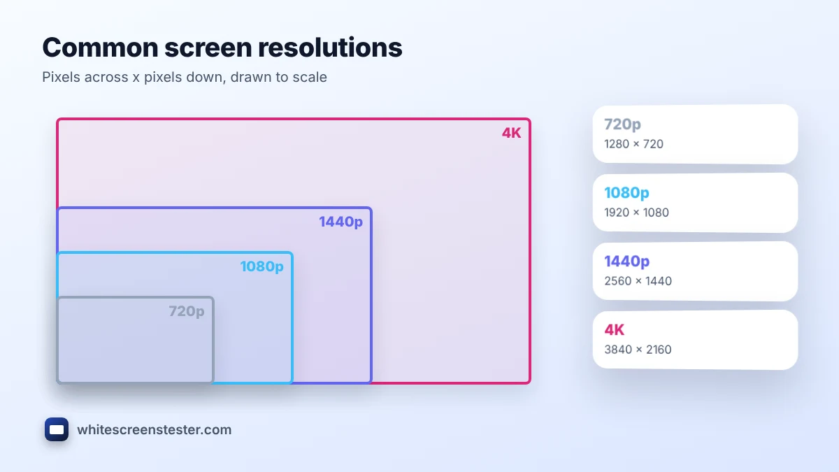
Common Screen Resolutions
| Name | Resolution | Aspect ratio |
|---|---|---|
| HD (720p) | 1280 x 720 | 16:9 |
| Full HD (1080p) | 1920 x 1080 | 16:9 |
| WUXGA | 1920 x 1200 | 16:10 |
| QHD (1440p) | 2560 x 1440 | 16:9 |
| Ultrawide QHD | 3440 x 1440 | 21:9 |
| 4K UHD | 3840 x 2160 | 16:9 |
| 5K | 5120 x 2880 | 16:9 |
How to Check Screen Resolution Without a Tool
- Windows 11 and 10: right-click the desktop, choose Display settings, and look at Display resolution. The one marked (Recommended) is the native resolution.
- macOS: Apple menu, System Settings, Displays. Mac shows a “looks like” size; the screen resolution checker on this page shows the real pixels as well.
- iPhone and iPad: there is no setting that lists it, so open this page in Safari, or look up the model specs.
- Android: Settings, Display, Screen resolution on many phones; otherwise open this page in Chrome.
- Chromebook: Settings, Device, Displays, then Display size.
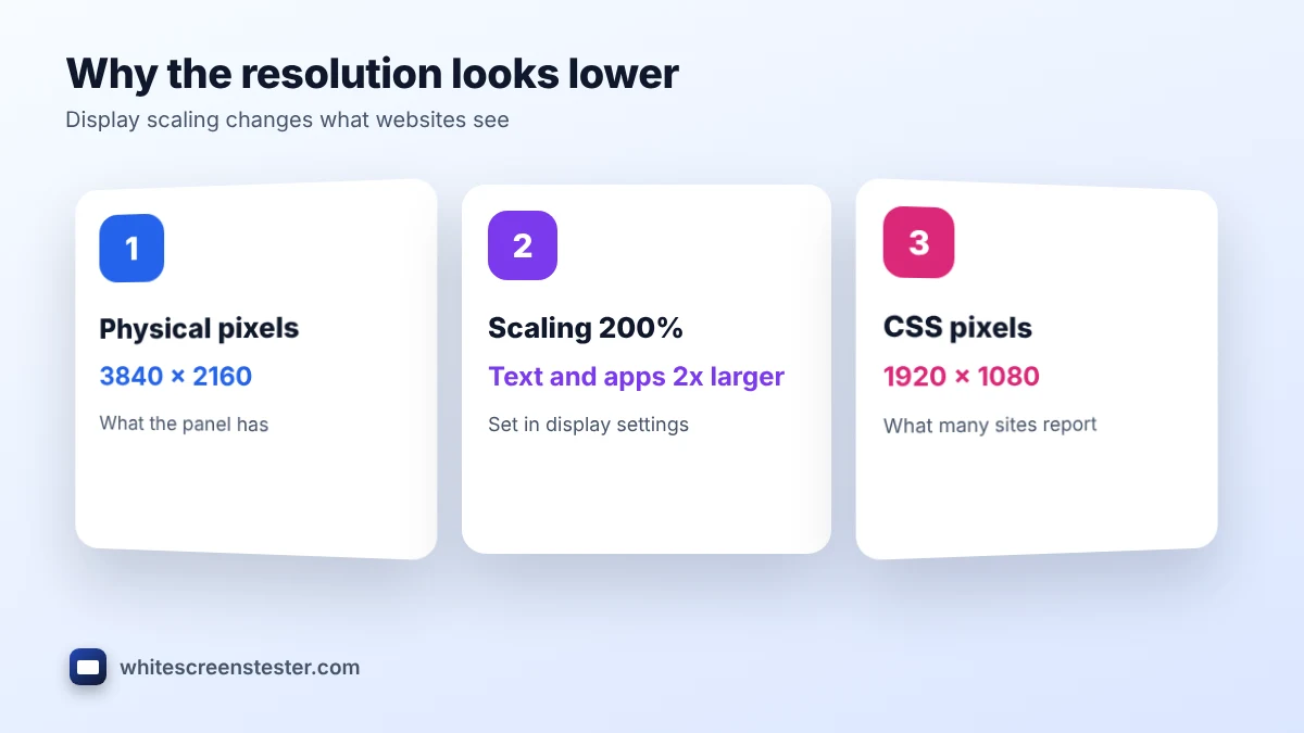
Why the Resolution Looks Lower Than Expected
The most common reason is display scaling. A 4K laptop set to 200% scaling lays out pages as if it were 1920 x 1080, so many websites report the smaller number. This screen resolution checker multiplies the CSS size by the device pixel ratio to show the true value. Other reasons are a resolution set below native in display settings, an old cable or adapter that cannot carry the full resolution, or a TV set to a lower input mode. Always run your screen at its native resolution for the sharpest text, and use scaling, not a lower resolution, to make things bigger.
Resolution, Screen Size and Sharpness
Resolution alone does not tell you how sharp a screen looks. A 27-inch 1440p monitor and a 15-inch 1440p laptop have the same number of pixels, but the laptop packs them more tightly, so text looks crisper. That density is measured in pixels per inch (PPI). Viewing distance matters too: a 4K TV looks sharp from the sofa even though its pixels are large.
Related Tests
Once the screen resolution checker has shown your resolution, check the panel itself with the dead pixel test and its motion with the refresh rate test. For a new display, our new monitor checklist covers every step.
Frequently Asked Questions
Is this screen resolution checker accurate?
Yes, for the screen the browser window is on. Browsers can round values slightly at unusual scaling levels, such as 125% or 175%.
Why does my phone show a smaller resolution than its specs?
Some Android phones run below their maximum resolution by default to save battery. Look for a resolution option in display settings.
Does it work with two monitors?
Yes. Drag the browser window to the other monitor and the values update for that screen.
Is any of my data stored?
No. All values are read by your browser and shown on the page. Nothing is sent or saved.